
Amsterdam Museum’s rebrand switches up a classic symbol of the Dutch capital
New branding for the Amsterdam Museum strives to modernise visuals long-associated with the city.
Studio Sallali Vaverka has rebranded the Amsterdam Museum, incorporating the St. Andrew’s cross, a symbol found across the Dutch capital.
Amsterdam Museum was founded in 1926, and has a collection of over 100,000 objects which seek to tell the story of the city’s past, present and future. It’s recently expanded into other directions, with a digital exhibition entitled Corona in the City.
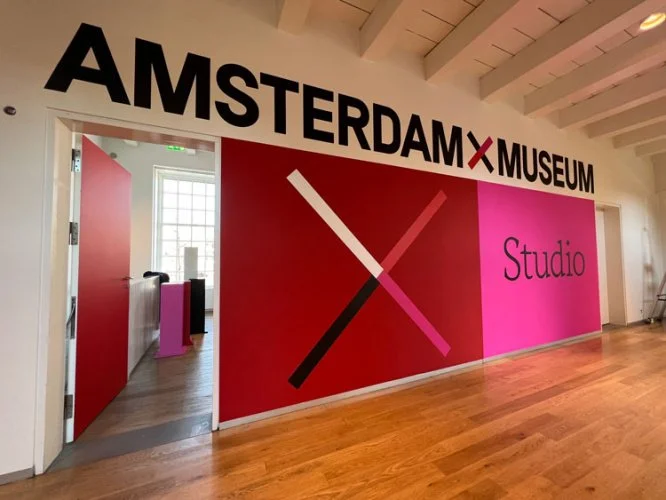
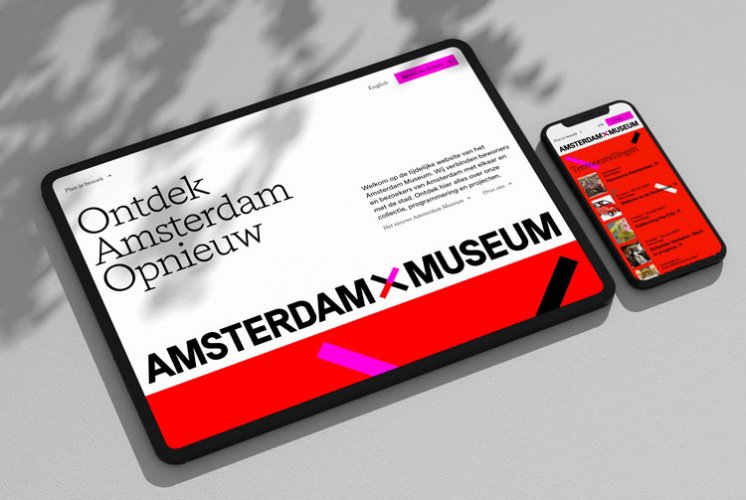
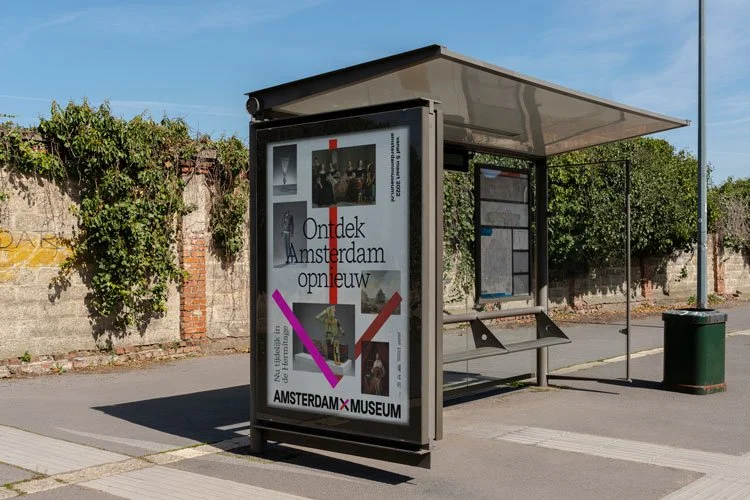
Studio Sallali Vaverka – a collaboration between Amsterdam-based graphic designers Hamid Sallali and Isabelle Vaverka – was responsible for rebranding the institution, followinga recent refurbishment. The identity can be seen in situ at the museum, and also across OOH communications.
“Our goal was to strengthen the identity by creating a couple of visual rules,” says Vaverka, explaining that the museum’s image had become disparate following a number of campaigns from different designers. The logo was inspired by the St. Andrew’s Cross, which has become a symbol of the city and can be seen on on the city’s flag.
Click here to see the full article
Credits
Client: Amsterdam Museum
Agency: Studio Sallali Vaverka
Source: Designweek