
McDonald's unveils graphic packaging to reflect brand's “playful point-of-view”
Branding agency Pearlfisher has redesigned the packaging at fast-food chain McDonald's to incorporate illustrations of the restaurant's classic menu items.
Set to be introduced across all of its global restaurants, the revamped packaging was designed to reflect the "innate joy of the McDonald's". Each item will now be served in packaging that contains a bright and simple graphic design representing the food inside.
"We were very excited to have the opportunity to bring the innate joy of the McDonald's brand back into the packaging by allowing each unique menu item to speak for itself," said Hamish Campbell, executive creative director at Pearlfisher.
"The bold graphic representations of menu items help make each piece of packaging more connected and evocative of McDonald's' playful point-of-view while bringing delight and ease to the brand," he told Dezeen.
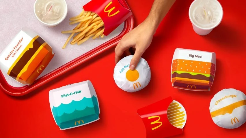
Pearlfisher worked with McDonald's to develop recognisable graphics that easily communicate what menu item the packaging contains.
"We strategically looked for the most direct way to communicate a playful and immediate expression of the product," explained Campbell.
"Anchored and inspired by the Golden Arches, each and every menu item is given the opportunity to appear as its best self: telegraphic, bold, and simple," he continued.
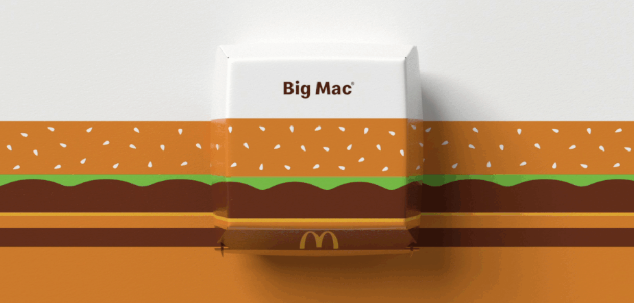
The Big Mac graphic