Kiki Cocktails’ identity eschews “stuffy cocktail hour” connotations
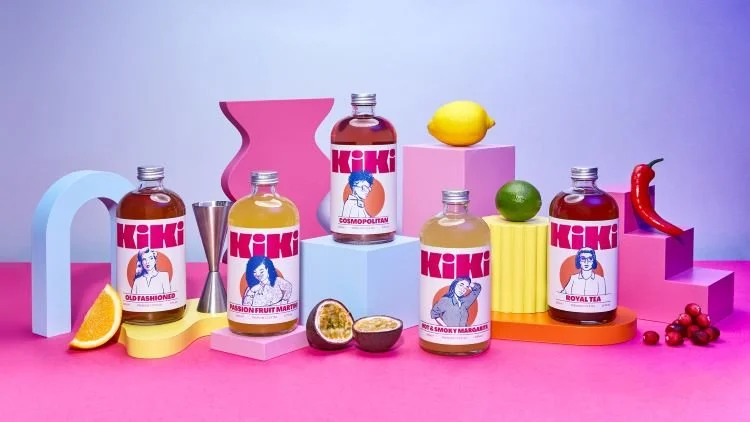
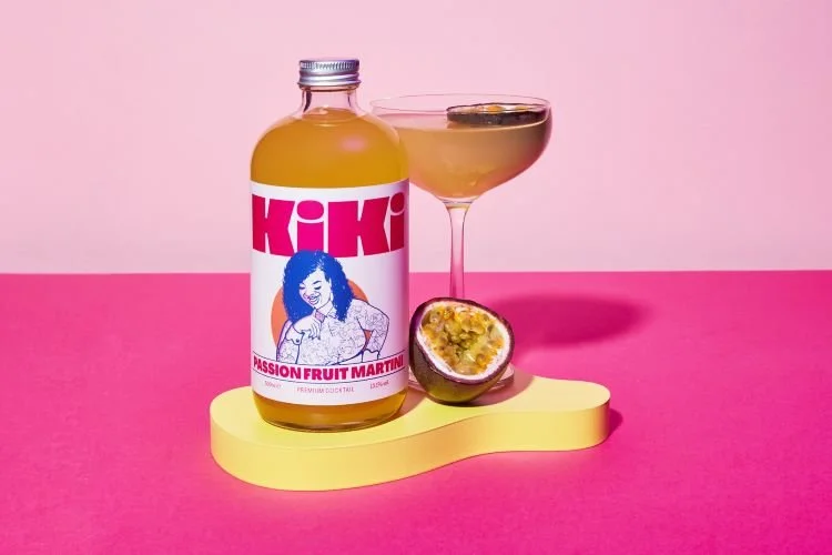
A new logotype now interacts with the brand’s bespoke illustrations on the bottle, each featuring a particular character.
Oat has rebranded Kiki Cocktails with a new identity, which borrows from the visual language of magazine front pages and mastheads.
Each cocktail now features an illustrated character, which overlaps a new logotype, coming together in a way which is reminiscent of a magazine cover and masthead.
Kiki wanted to represent inclusivity and shared moments through the brand, moving away from the “stuffy traditional notions of cocktail hour”, says Oat founder and creative director Tori Phillips-Walmsley.


