“Dyslexia legibility and designer usability”: Daniel Brokstad’s new typeface
Inconstant Regular has been designed to kickstart the There’s Nothing Comic About Dyslexia campaign, which challenges designers to create a dyslexia-friendly typeface.
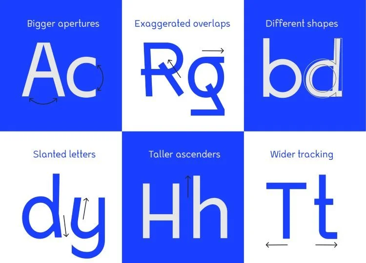
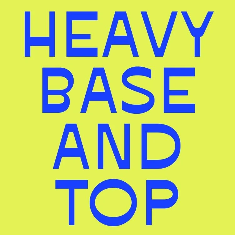
Norwegian graphic designer and illustrator Daniel Brokstad has created a new dyslexia-friendly typeface called Inconstant Regular, which aims to “strike a balance between dyslexia legibility and designer usability”.
The typeface has launched today as part of Innocean Berlin and Dyslexia Scotland’s There’s Nothing Comic About Dyslexia campaign. The campaign highlights that the divisive font Comic Sans is one of the easiest for people with dyslexia to read and challenges designers to create their own dyslexia-friendly font using the guidelines created by Innocean Berlin and Dyslexia Scotland.
Following this, he explains how he sketched out a “huge range of glyphs and concept entry points” and eventually came up with the solution of being “inconsistently inconsistent”. Brokstad says he created “three different stylistic sets” of the font that could then be adapted to become more irregular or more “consistently inconsistent” depending on the preference of whoever is using it.
He adds that some “variable accessibility features” were axed during the design process as they “sacrificed too much of the aesthetic”, defeating the point of winning over both designers and neurodiverse people.